
The Q-method used in O’Neill et al. (2013) has proved a great way of getting students and expert audiences engaged with the complexities surrounding the visual communication of climate change. It is also been a useful teaching source for students on more advanced qualitative methods training. I have posted the materials here for others to use in similar ways.
The climate change visual Q-method study is detailed in O’Neill et al. 2013, with the image concourse drawn from the research in O’Neill (2013).
Download the materials to run this experiment:
1. Q-method instructions and sorting grid
2. Visual image concourse
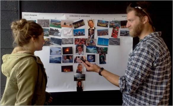
I have the visuals printed out in colour (and laminated) at postcard size. You’ll need to print the sorting grid at A0 size to fit the images in the grid.
Suggested teaching/outreach ideas:
Run the experiments as per the instruction booklet. Then show your participants the published results from Australian, UK and US participant cohorts (these slides may be useful) and see how similar the results are. Why might they be similar? Can they explain any differences?
I have always found results remarkably similar across participant cohorts, echoing the O’Neill et al. 2013 finding of a single, consistent visual climate discourse (at least in English-speaking nations – I’d be interested to hear if you run this in other countries!)
*** 2016 update: Metag et al (2016) used a similar method and broadly similar images to explore how audiences in Austria, Germany and Switzerland engaged with climate imagery. Interestingly, they found very similar results to those we reported in O’Neill et al. 2013; suggesting that there is a stable visual discourse across, at least, Western Europe. This makes intuitive sense, considering the international reach and visual agenda-setting power of image banks such as Getty Images.***
These materials have been successfully used for / by:
- Teaching Environmental Communication students at the University of Liverpool, by Antal Wozniak (2024)
- Teaching students about mixed method (quantitative/qualitative) social science; Dr Simone Rödder, SICSS, Universität Hamburg ‘Introduction to the Social Sciences’ (2014)
- A webinar on visual climate communication with participants of the UK’s Envrionment Agency Climate Science webinars (2014)
- Teaching students in Geography (inc. Making Carbon Public: Risk, Climate and the Politics of Energy, Exeter University, UK, 2012-2014; and Environmental Politics and Management module at the University of Melbourne, Australia, 2011)
- Teaching students in Politics (Dr Duncan Russell, The Politics of Climate Change, Exeter University, UK, 2012-2014)
- Teaching students research methods (Human Geography Practice, Exeter University, UK, 2012-3)
- Training journalists specialising in environment reporting (through the Asia Pacific Journalism Centre, as part of the Reporting Climate Change and the Environment training programme) (2011)
I’d appreciate it if you let me know if you plan to use these materials for teaching or research (via email). Likewise, please do send on any feedback. If you use the materials in published work, please cite the O’Neill et al. (2013) study.
